
A logo has an unusual job description. It has to work at sixteen pixels in a browser tab and on the side of a building, in full colour and stamped in one, on white and on a photograph, at speed and in passing.
- Legible at every size
- Every file format delivered
- Clear usage rules
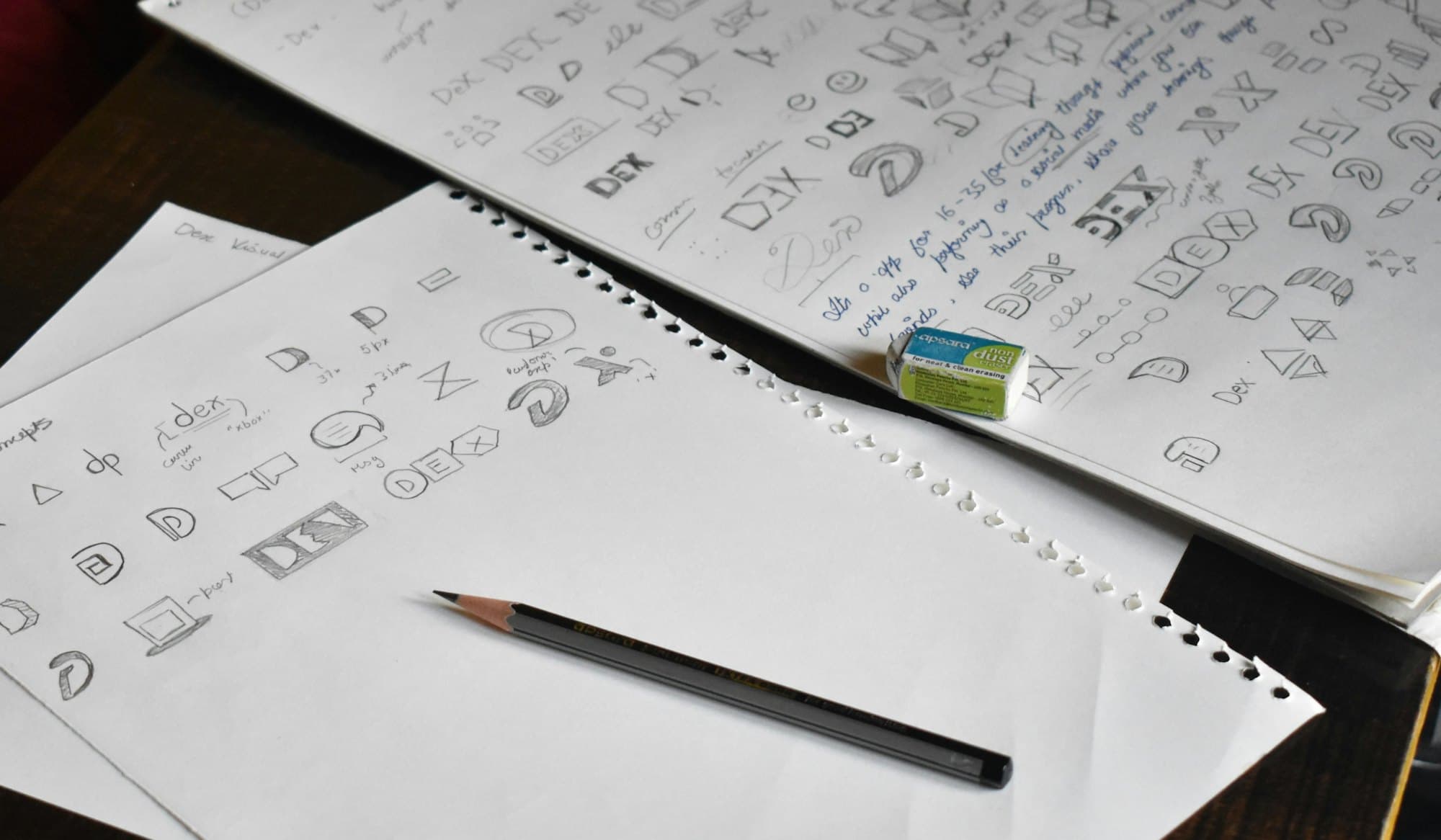
That set of constraints, not taste, is what makes most logos fail. A mark with fine detail and a gradient looks excellent in the presentation deck and turns to soup in a favicon. We design against the smallest and harshest use first, then let it look good at large sizes, which is the easy direction.
The other half is delivery. A logo handed over as a single file is unfinished. You need every format and lockup your team will reach for, plus rules clear enough that the next person to place it does not invent a new version.
What the work includes
- The primary mark
- Designed and tested at favicon size, in one colour, reversed out of dark, and at large format before it is signed off.
- Lockups
- Horizontal, stacked, icon only and any others your layouts actually demand, so nobody has to improvise one at deadline.
- Clear space and minimum size
- The rules that keep it legible, written down. Most logo degradation happens through well-meaning misuse rather than bad design.
- Colourways
- Full colour, single colour, reversed, and a defined behaviour over photography, with the values specified for print and screen.
- Every file format
- SVG, PNG at several sizes, PDF and EPS, plus the favicon and app icon set, named so the right one is obvious.
- Usage guide
- A short document showing correct and incorrect application. Short enough that people will read it, which is the whole point.
How it runs
01Understand the business first
What you do, who buys, who you sit beside in a list. A mark is a distinguishing device, so it has to be designed against the field it appears in.
02Explore in black and white
Colour is persuasive and hides weak form. If the mark does not work in one colour it does not work, and colour is only postponing that finding.
03Test at the extremes
Favicon, embroidery, signage, a video thumbnail. Routes that survive all four get developed; the rest get discarded.
04Refine and deliver
One route developed properly, with lockups, colourways, files and the usage guide as a single handover.

Is this the right thing to buy
Who it suits. New businesses that need a mark before they can print anything, and established ones whose current logo fails in practical use: illegible at small sizes, unusable in one colour, or existing only as a low resolution image somebody found on an old hard drive.
When it is the wrong call. If your materials look inconsistent, a new logo will not fix that and buying one is money spent on the wrong problem. Inconsistency comes from having no type, colour or layout system, which is branding rather than logo work. We would rather sell you the thing that actually solves it.
What it costs. A fixed price covering three routes, development of the one you choose, all lockups and colourways, every file format, and the usage guide. There is no per-revision charge inside the agreed rounds. The main thing that changes the number is whether you also need the wider identity system, in which case it is usually cheaper to buy them together than in sequence.
Questions we get asked
How many concepts do we get?
Three routes, each genuinely different, rather than twelve variations of one idea. A large number of concepts sounds generous but usually means each got a few hours. We would rather explore three properly and develop the one you choose.
Do we own the logo?
Yes, fully, on final payment, including the source files. We will also tell you plainly that a logo is not automatically a trademark. If protecting it matters, that is a separate legal step and worth taking before you print anything.
Is a logo the same as branding?
No, and conflating the two causes most disappointment with logo projects. The logo is one mark. Branding is the type, colour, imagery and tone that make everything else recognisably yours. A logo alone will not make an inconsistent business look consistent.