
Positioning in one page
What you do, who for, and what makes you a different choice. One page, because a document nobody reads changes nothing.
(Services / More Services)
Software, and the identity it ships under
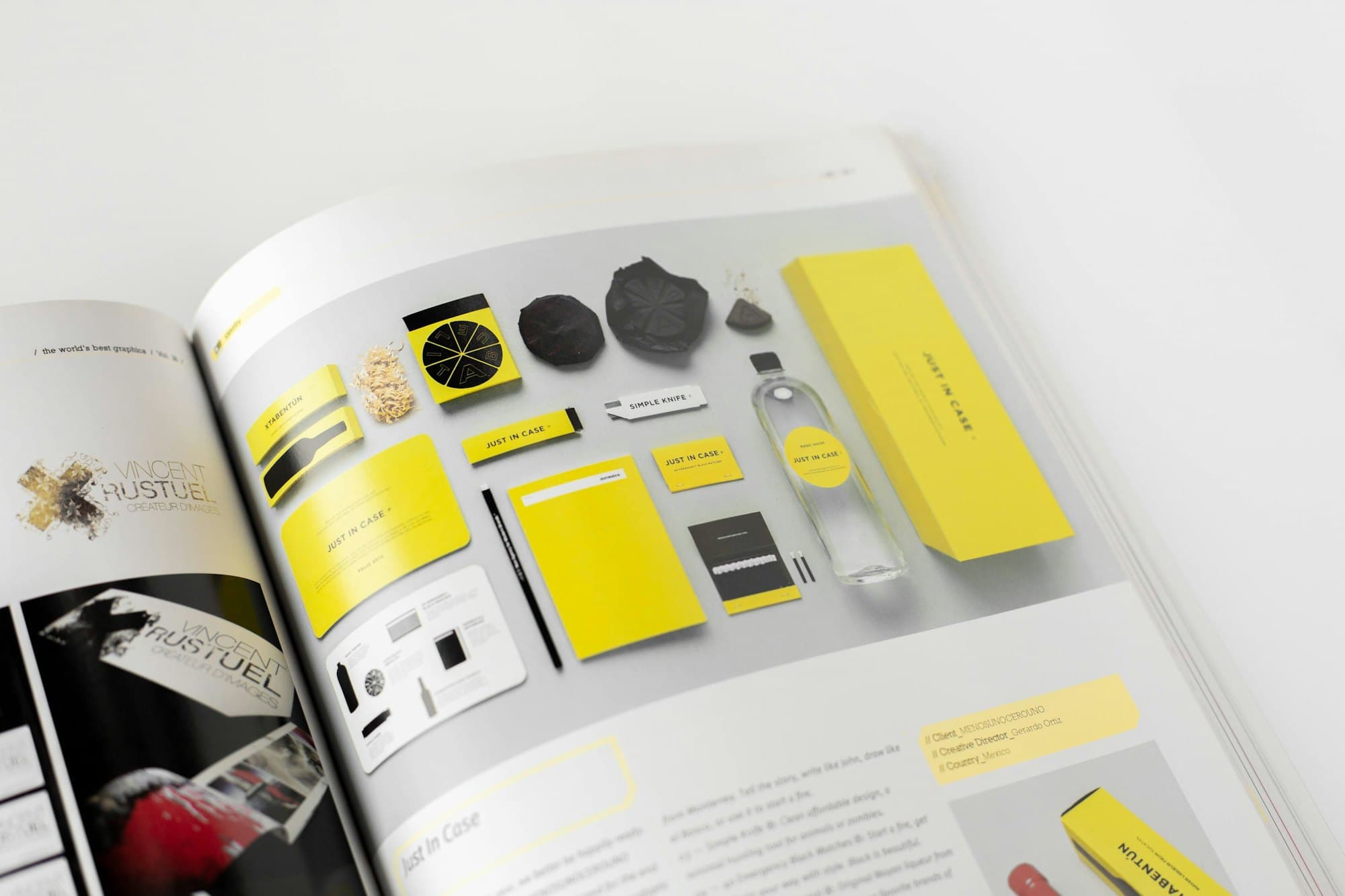
Positioning in one page, a type and colour system with defined roles rather than a mood board, imagery direction shown through real examples, and editable templates for the five things you produce most often. The templates are the part that decides whether any of it survives: they are what holds the identity together when somebody needs a deck by four o clock and no designer is nearby.
Branding is not the logo. It is everything that makes a proposal, an invoice, a job advert and a Reel look like they came from the same company. Most businesses have a logo and no brand, which is why their materials look like six companies wearing the same badge.
The test of an identity is not the presentation. It is what happens six months later when someone in your team needs a slide deck by four o clock and reaches for whatever is nearest. If the system is clear, the result still looks like you. If it is not, entropy wins and the brand slowly becomes whatever is easiest.
So we design for the person who will apply it under time pressure without a designer nearby. That means fewer options, clearer rules, and templates for the things you make most often.
What you do, who for, and what makes you a different choice. One page, because a document nobody reads changes nothing.
Two families at most, with a defined scale and rules for headings, body and small print. Licences sorted for web and print.
A palette with defined roles rather than a mood board, including contrast-checked pairings so accessibility is not an afterthought.
What photography and illustration should look like, with real examples of right and wrong, not adjectives.
The five things you produce most, built as editable templates. This is what makes an identity survive contact with a deadline.
Short, practical and written for the person applying it. A hundred page manual is a document nobody opens twice.
Interviews with your team and, where possible, your customers. The difference that matters is usually one your customers name and you undersell.
Type, colour and layout designed as a working set, tested on the real materials you produce rather than on invented mock-ups.
Applied to a genuinely awkward case, like a dense specification sheet or a text-heavy proposal. Systems that only work on beautiful layouts do not work.
Templates built, guidelines written, and a session with the people who will use it, because a system nobody was shown is a system nobody follows.
Businesses whose materials look like they came from several different companies, or who are about to grow past the point where one person can keep everything consistent by eye. It is also the right moment when you are hiring: a new starter with no system will invent one.
If you are pre-revenue and still changing what you sell, this is early. Identity work locks in decisions about who you are talking to, and locking those in before you know is expensive to undo. A logo and a defined type and colour pair will hold you until the business settles.
Fixed price against a defined deliverable list, with the number driven mostly by how many templates you need built. The strategy and interview phase is a constant. Template production is the variable, and it is worth being generous there, because templates are what make an identity survive a deadline. Six to ten weeks is typical, and projects that overrun almost always do so waiting on decisions rather than on design.
Logo design produces one mark and its usage rules. Branding produces the whole system the mark lives inside: type, colour, imagery, tone and templates. If your materials look inconsistent, a new logo will not fix it, because the logo was probably never the inconsistent part.
A refresh keeps the recognisable equity and fixes what is failing, usually type, colour and application. A rebrand is warranted when the business has genuinely changed what it does or who it serves. Rebranding a business your customers already recognise throws away something you paid years to build.
Six to ten weeks for most businesses, with the longest part being the interviews and the shortest being the visual design. Projects that overrun almost always do so waiting on decisions, which is why we agree who signs off before starting.